Term 3 Pictures
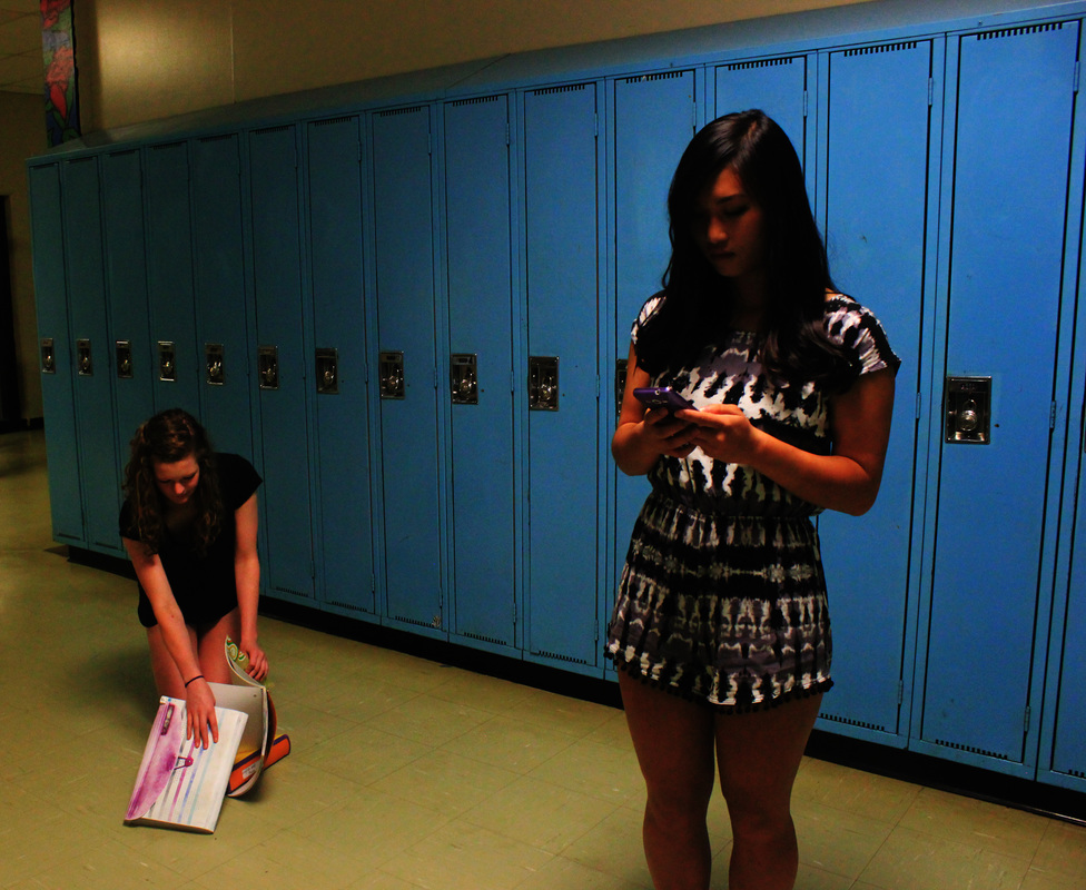
This picture shows teenage phone addiction. Emily is struggling to pick up her books while Ryann is completely oblivious to it because she is on her phone. What I'm trying to show is how phone addiction can stop teenagers from learning more about the world and the real problems and crises we have today such as poverty and environmental issues. Phones distract teenagers from other more time worthy things such as learning about these issues.
I chose to base my pictures on a song called Demon. Unfortnately, my best picture wasn't able to upload because of size restrictments but there are my other three. Listening to this song makes me think of a person who has pushed away someone they have loved to protect them and has lost all hope in getting them back. That's what I tried showing in the second picture. When I listen to this song, I think of grey colors along with black and white colors. That's why I did the first picture. It also kind of shows a deeper underlying meaning. In this song, the singer talks about where his demons hide. In my opinion, he is kind of saying that everyone has to sides to them. I made the entire picture grey because I wanted to show that everyone has to sides to them. One side that we know and the other side that we don't know. That is also what the third picture is trying to show. On the outside she looks all innocent and happy but in the mirror we can see her depressed and dark reflection which is who she really in on the inside.
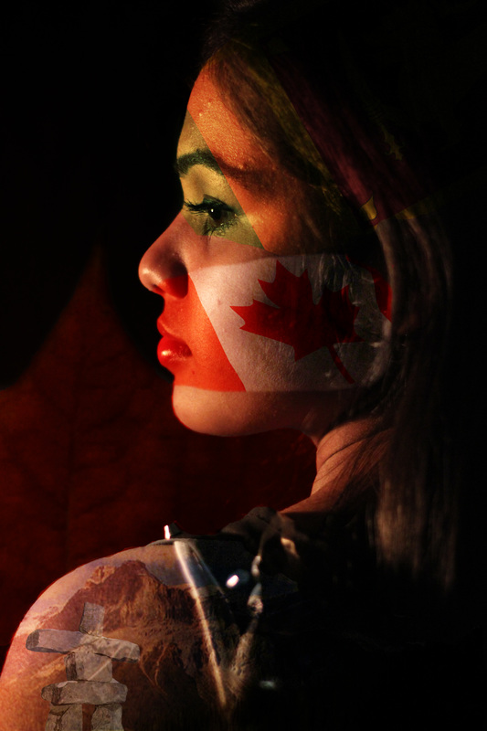
When I think of culture I often think of Canadian symbols. That’s why I added the Inuksuk to represent the 2010 Olympics games in Vancouver. I chose the Inuksuk because I really enjoyed the 2010 Olympics and seeing all of Vancouver in the Olympic spirit. When I think of Canada, especially British Columbia, I think of vast lakes and majestic mountains to remind me of the beautiful wildernesses we have here. That’s why I added the mountains. I decided to add the Canadian flag right in the middle of my face to show that it was most part of my culture. When I think of Canadian weather I imagine autumn with heavy rains and leaves falling. I also think of snow. Adding snow didn’t look right in the picture so I added a big maple leaf at the back. On top of the Canadian flag, I added the flag of Sri Lanka because I was born there and I feel like it’ another part of my culture that I haven’t learned and appreciated enough yet. That’s why I made it a bit less obvious than the Canadian flag to kind of show that it’s being overshadowed by the Canadian part of my culture. I decided to blend the pictures into me because then it could kind of show that all of it is part of me.
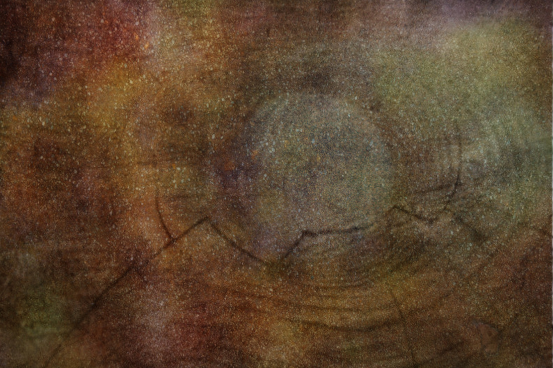
The photographer we chose was Frans Lanting. His overall goal is to encourage people to care more about Earth and it's nature but he does it through photos. The first picture was inspired by his picture called The Big Bang Theory from his greatest project called Life A Journey through time where he uses images as a timeline of how Earth developed. I used a tree trunk and then edited it on Photoshop. I added different layers of different colors and pictures. I used a mocha background , Christmas lights, green moss, and a big blue ornament. Then I had to experiment with the opacity and the blending mode until it was just right.
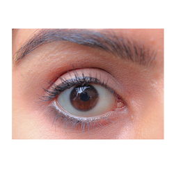
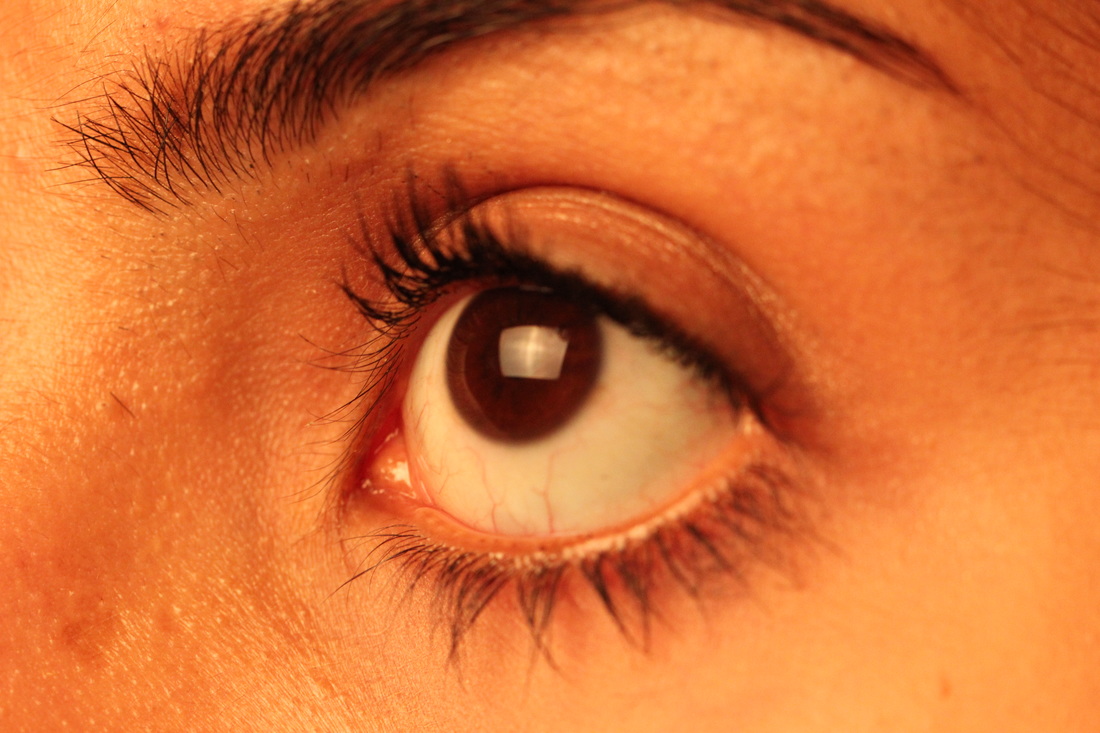
I really like this ornament picture because of the holiday feeling it gives me. It was part of my creative framing assignment. What I liked about this framing was that the branches of the Christmas tree just naturally framed the ornament. The eye picture was for the fill in the frame part. I zoomed in on her eye and made sure it fitted most of the entire picture.
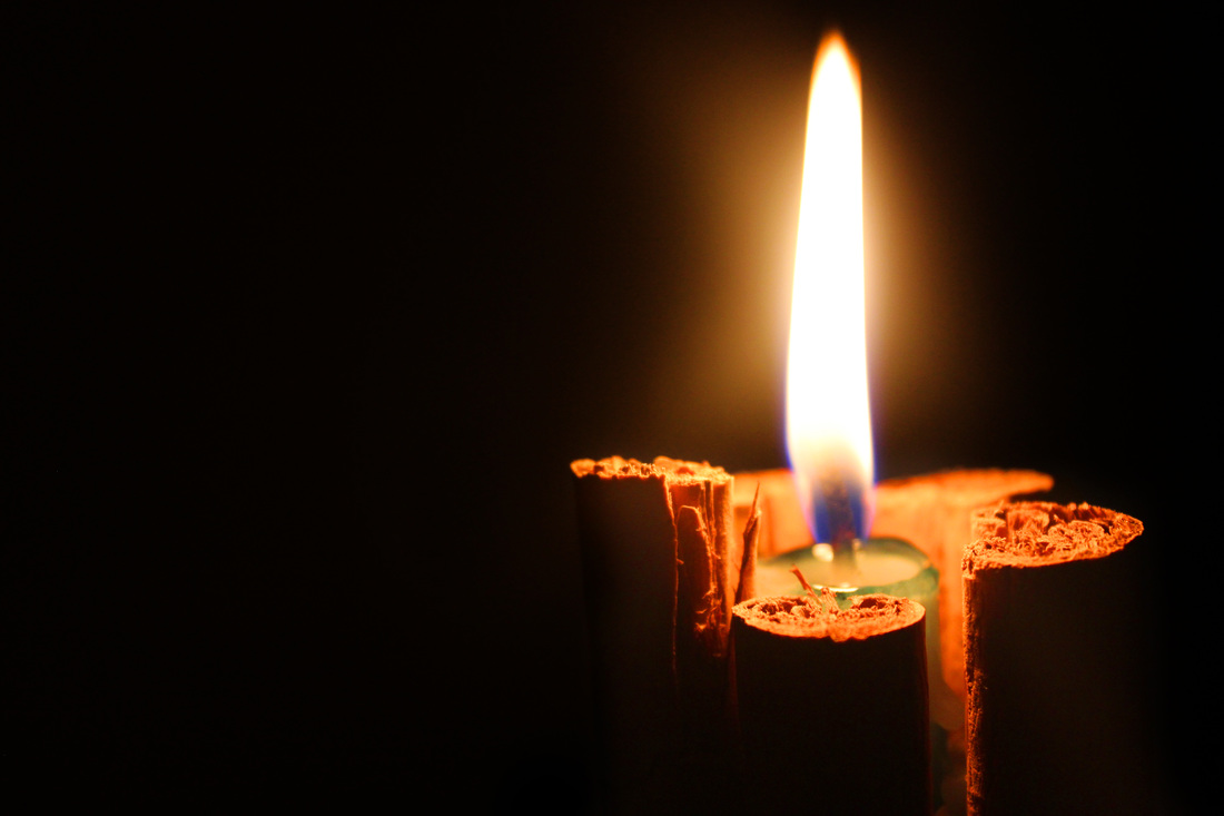
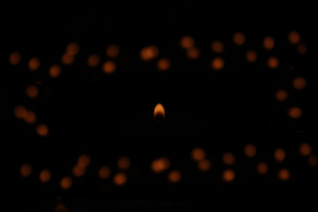
For the first picture, I wanted to do a plain candle but it looked boring so I decorated it with cinnamon sticks. The lights were off when I took the picture but the image looked a bit messy with the glare from the flame of the candle so I burned it out on Photoshop. This picture is my favorite photo of the week picture because it gives me a calm and quite feeling. For the last one, I set the apertureto the last one and then I set the shutter speed to twenty five. The flame looked boring alone so I added a bunch of other candles in the back. It took a lot of experimenting to get it right. In Photoshop, I duplicated the extra candles at the back and moved it to the front. Overall, I am very happy with the way this picture turned out.
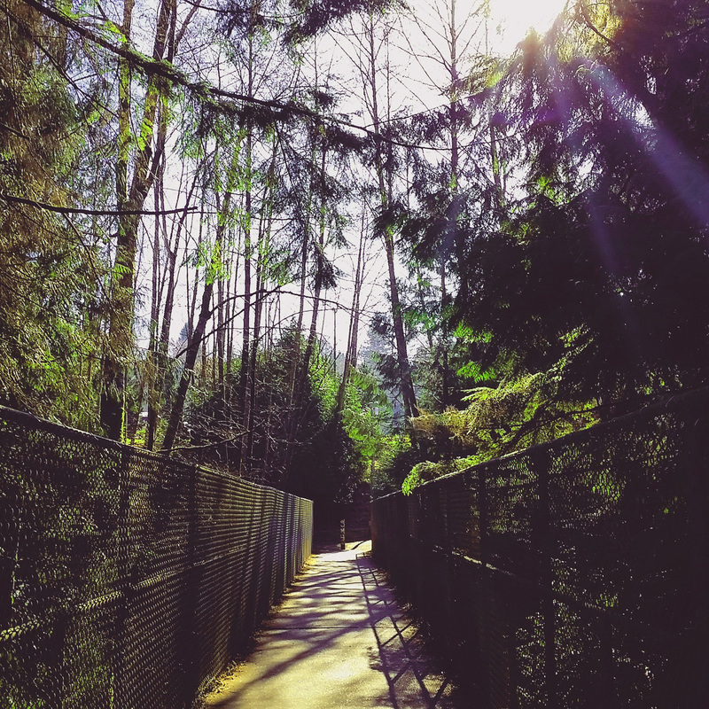
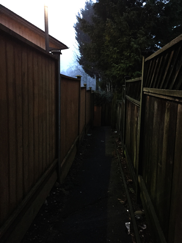
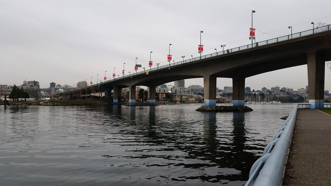
The theme of the photos is pathways. I chose to upload the bridge one because it looks happy and cheerful so it gives it a bit of an inviting look to it. I took it on my phone rather than on a camera because I did not have one with me at the time. When I see that picture the first thing that comes to my mind is spring. The second picture is more of a dark and mysterious style. It was taken early in the morning while I was walking to school. On Photoshop, I increased the contrast and burned it a little bit to make gloomier and seem more mysterious. The fact that it was taken in the morning also helps with the mood.
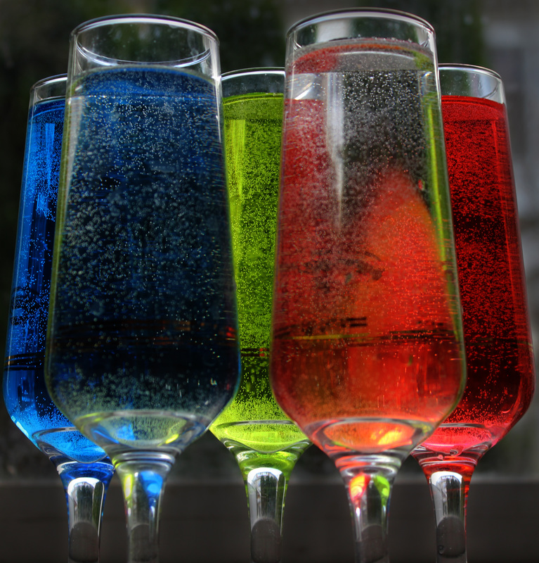
I took this picture to show colors being reflected. Only the three glasses at the back have colored water. The two glasses at the front have clear water. It took a lot of picture from different angles to get this picture and coloring right because at the front angle, only two colors are being reflected but at the bottom you can see hint of red and green which is how I like it. I like this picture because the colors along with the dark background give it an abstract look.
My Favorite Pictures
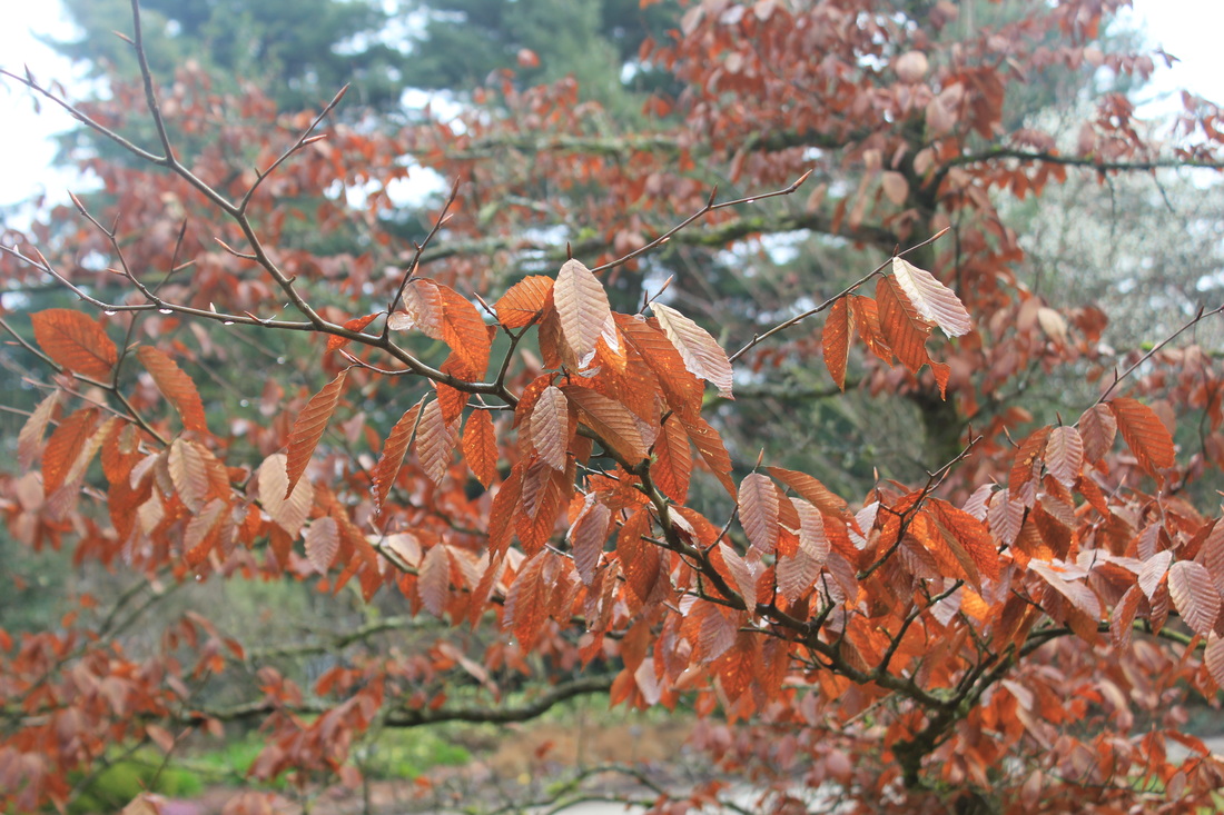
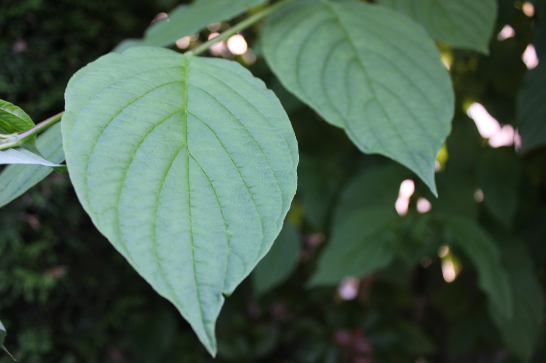
I really like this picture because of how the front branch clearly stands out ad the others are all blurry. I did not even edit this picture on Photoshop because I like it the way it is. Although the sky is cloudy, it does not really give the picture a dull effect because the brownish orange color of the leaves match with it. I like the warm color of the leaves against the colder color of the grey sky.